![foursixty_logo_vector.png]](https://support.foursixty.com/hs-fs/hubfs/foursixty_logo_vector.png?height=12&name=foursixty_logo_vector.png)
Please note: These steps are best followed when on a desktop instead of mobile.
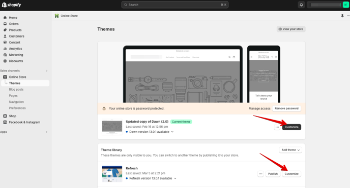
Step 1
In your Shopify Admin, click on Online Store, then click on the Customize button for the theme that you want to add the gallery to.
Step 2
When the Theme Manager opens, you will brought, by default, to your Home Page.
On the left-side, scroll down to the bottom and click on the + Add section prompt above the footer area.
A new box will appear, click on the Apps tab and select the gallery that you want to add to your Home Page (we recommend either Slider or Mini-Feed for Home Pages).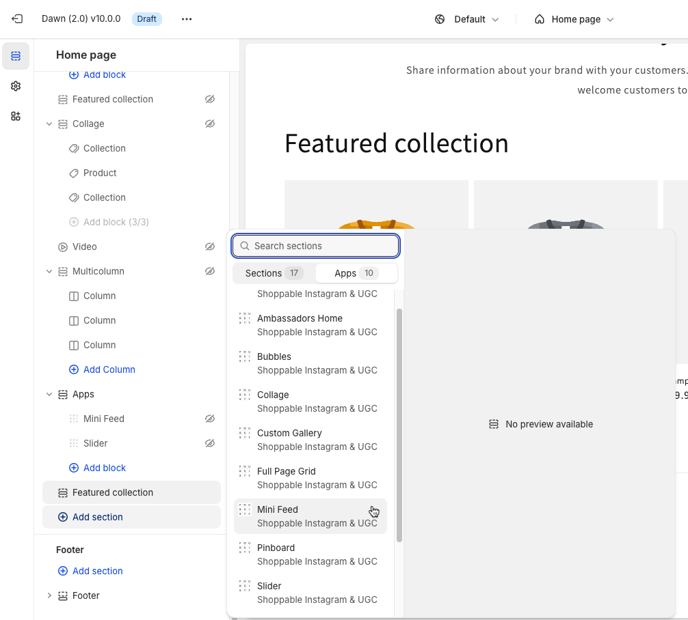
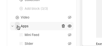
Step 3
The section that you have added will now appear on the left side under an Apps header.
If you want to reposition your gallery to another place on your Home Page, hover over the icon beside the Apps line (until it becomes 6 dots), then click and hold those dots while dragging the line to the place on the page where you want the gallery to appear.
|
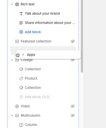 |
Step 4
Now that you have the gallery placed where you want it on the page, you are ready to customize the gallery to make it your own!
Click on the gallery type that you chose (under Apps on the left-side) and the settings will appear for you to configure.
There are two groups of galleries; standard and specialized.
Standard galleries include Slider, Mini-Feed, Collage, and Full Page Grid.
Specialized galleries include Bubbles and Pinboard.
Depending on the type of gallery you have chosen, the settings are going to be a little different.
- If you are using Standard gallery styles (Slider, Mini-Feed, Collage, or Full Page Grid), then please reading on below.
- If you are using Specialized gallery styles (Bubbles or Pinboard), please click here to see those customization options.
If you are adding Product Page Galleries, the only 2.0 section that supports the required attributes is the SLIDER gallery.
It will auto-detect the Product Page template and add the attributes needed.
Standard Gallery Styles
The Standard gallery styles are broken down into several sections:
- Hover and Overlay Controls (for Desktop devices).
- Gallery-Specific Settings.
- General Fonts and Styling Controls.
- Additional Settings, Scripts, and CSS.
1. Hover and Overlay Controls
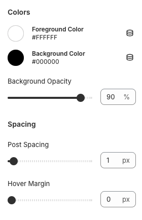
Colors:
- Foreground Color: This allows you to customize the color of the CTA and icon that appears on hover when viewing the gallery on Desktop devices.
This does not have an affect to mobile device galleries (as there is no hover on Mobile). - Background Color: This allows you to customize the color of the background hover over the image when viewing the gallery on Desktop devices.
This does not have an affect to mobile device galleries (as there is no hover on Mobile). - Background Opacity: This allows you to customize how transparent the color of the background hover over the image is when viewing the gallery on Desktop devices.
100% is a solid color and reducing it from there makes the background more transparent.
- Post Spacing: This allows you to customize the amount of space that appears between each image of your gallery.
- Hover Margin: This allows you to customize the if the background hover color appears over the entire image in the timeline, or just the middle of the image.
This does not have an affect to mobile device galleries (as there is no hover on Mobile).
2. Gallery-Style-Specific Controls
- Slider
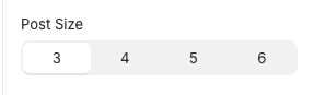
Post Size: This allows you to determine how many images show on the (Desktop) screen at one time.
Mobile screens will default show this gallery 2-wide. - Mini-Feed
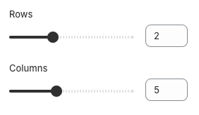
Rows: This allows you to determine how many rows of images show across the (Desktop) screen at one time.
Columns: This allows you to determine how many images show in each row (Desktop).
Mobile screens will default to alternating the settings above.
Example: The settings in the above image will appear as 2 images per row x 5 rows on Mobile. - Collage and Full Page Grid
There are no gallery-specific settings for these types.
3. General Fonts and Styling Controls
 |
 |
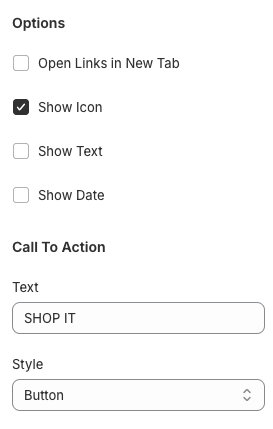
Options:
- Open Links In New Tab: This tells the gallery to open links that are clicked (on the image or by clicking the thumbnail image) in a different browser tab.
- Position Arrows Outside: This option only shows up for Slider galleries and allows you to have the arrows to show the last and previous series of images outside the gallery instead of as hovers over the gallery.
The arrows only show up on Desktop devices, but the extra space they reserve shows up on both Desktop and Mobile.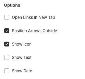
- Show Icon: This tells the gallery to show the service icon (Instagram, etc.) in the hover on Desktop devices.
This does not have an affect to mobile device galleries (as there is no hover on Mobile). - Show Text: This tells the gallery to show the text/context of the post that was added to the social network in the hover on Desktop devices.
This does not have an affect to mobile device galleries (as there is no hover on Mobile). - Show Date: This tells the gallery to show the date the post was added to the social network in the hover on Desktop devices.
This does not have an affect to mobile device galleries (as there is no hover on Mobile).
Call To Action:
- Text: This allows you to customize the call to action text that shows in the hover on Desktop devices.
This does not have an affect to mobile device galleries (as there is no hover on Mobile).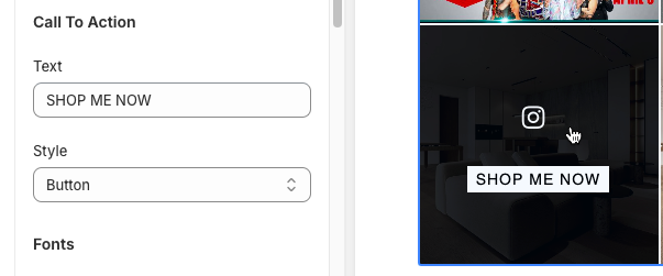
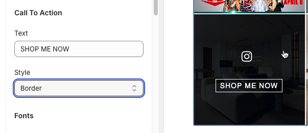
- Style: This allows you to specify how the call to action text appears in the hover on Desktop devices.
This does not have an affect to mobile device galleries (as there is no hover on Mobile).
Available options include:
- Button: The text shows up like a button over the background (like seen in the image above).
- Border: The text shows up within a border that changes color on hover over the background.
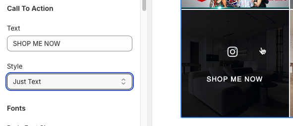
- Just Text: This shows the text on hover over the background but does not style it up beyond the font chosen, size, and color.
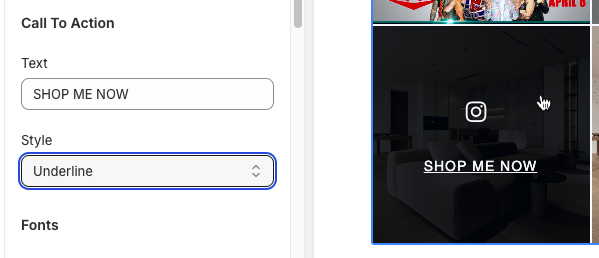
- Underline: The text shows up Like a standard link with the text underlined on hover over the background.
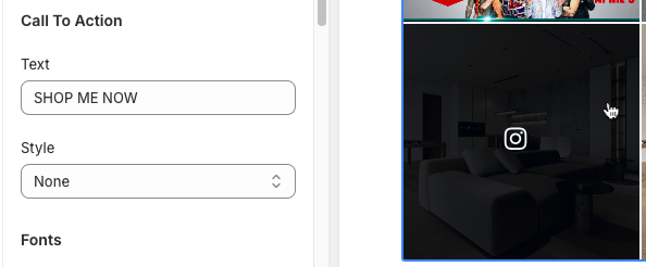
- None: The text does not show up at all on hover.
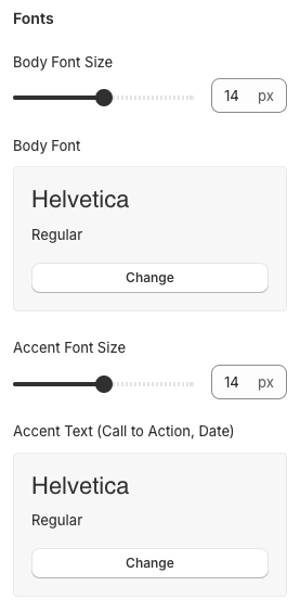
Fonts:
- Body Font Size: This allows you to customize the size of the social post text that is displayed when Customers click the gallery image and see the pop-up.
- Body Font: This allows you to customize the font used to show the social post text that is displayed when Customers click the gallery image and see the pop-up.
- Accent Font Size: This allows you to customize the size of the text that is used when Customers see your Call To Action on hover, plus also controls the size of the Social Network username and date within the pop-up.
- Accent Text (Call to Action, Date): This allows you to customize the font used to show the Call To Action on hover, plus also controls the font used for the Social Network username and date within the pop-up.
4. Additional Settings, Scripts, and CSS
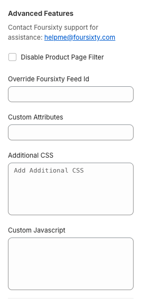
These setting areas are generally reserved for those customers who are familiar with scripting, CSS, and other settings.
It also can be used by customers upon the recommendation of the Foursixty Support Team when reaching out to helpme@foursixty.com.
- Disable Product Page Filter: This allows you to "turn off" the filter that shows just posts/images that are tagged with a matching product on product page galleries.
- Override Foursixty Feed ID: This allows you to specify a Foursixty ID when the gallery code does not detect it or detect it correctly.
Generally, this area is left blank as the gallery will pull the information from the account you have connected to your Foursixty App. - Custom Attributes: This allows you to add attributes to alter how the gallery works.
Generally, this is only used under the direction of the Foursixty Support Team as they would also supply the attributes added in there. - Additional CSS: This allows those who are familiar with using CSS for styling or those under the direction of the Foursixty Support Team to add additional CSS commands that will change the look of certain parts of the gallery.
Examples of this include (but are not limited to) removing the social share buttons from the pop-up, hiding the social post text completely, and other customizations. - Custom Javascript: This allows those who are familiar with using Javascript controls or those under the direction of the Foursixty Support Team to add additional script(s) that will help the gallery work better with your specific theme.
Examples of this include (but are not limited to) connecting to an AJAX cart system, or some translation text.
As always with Shopify Themes, make sure that you are clicking the Save Button after each customization to make sure it is applied to your galleries and not potentially lost because of a browser mishap.
If there are any other questions or concerns that come up that we can help answer for you, please feel free to reach out to the Foursixty Support Team at helpme@foursixty.com.
Specialized Gallery Styles
Specialized gallery styles (Pinboard and Bubbles) operate a little differently than Standard galleries do, so they have their own settings that can be configured.
The Specialized gallery styles are broken down into several sections:
- Hover, Overlay Controls (for Desktop devices), and Gallery-Specific Settings.
- General Fonts and Styling Controls.
- Additional Settings, Scripts, and CSS.
1. Hover, Overlay Controls (for Desktop devices), and Gallery-Specific Settings
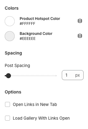
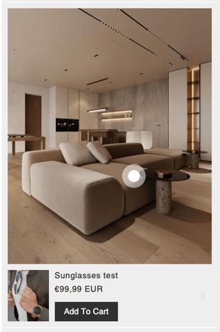
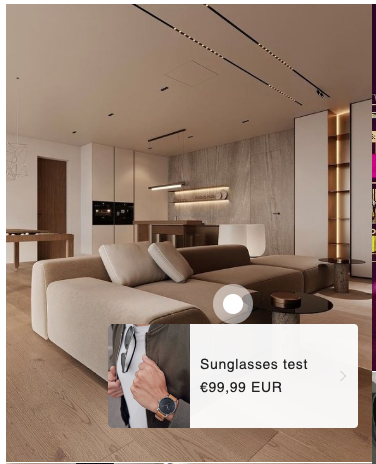
- Product Hotspot Color: This setting allows you to determine the color of the pin or spot visible that you tag on the image to identify the product.
- Background Color: This setting is only visible in the Pinboard-style gallery and it allows you to determine the color of the background behind the image block in the main gallery.
Spacing:
- Post Spacing: This allows you to customize the amount of space that appears between each image of your gallery.
Options:
- Open Links In New Tab: This tells the gallery to open links that are clicked in a different browser tab.
- Load Gallery With Links Open: This option tells the gallery to auto-open the product links tagged to the images, reducing the number of clicks needed to convert sales.
2. General Fonts and Styling Controls
Fonts:
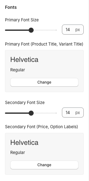
- Primary Font Size: This allows you to customize the size of the product and variant title text that is displayed.
- Primary Font (Product Title, Variant Title): This allows you to customize the font used to display the the product and variant title text.
- Secondary Font Size: This allows you to customize the size of the product price and variant option labels text that is displayed.
- Secondary Font (Price, Option Labels): This allows you to customize the font used to display the the product price and variant option labels text.
Add To Cart:
These additional settings are exclusive to the Pinboard gallery.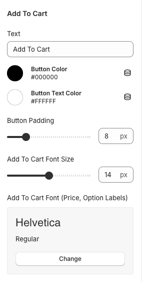
- Text: This is the text that shows in the CTA Button.
- Button Color: This is the background color for the CTA button.
- Button Text Color: This is the color for the CTA button text.
- Button Padding: This is the amount of padding around the CTA text that helps make up the size of the button.
- Add To Cart Font Size: This is the size of the text shown in the CTA button, prices, and variant option labels.
- Add To Cart Font (Price, Option Labels): This lets you choose the font of the text shown in the prices and variant option labels.
3. Additional Settings, Scripts, and CSS
These setting areas are generally reserved for those customers who are familiar with scripting, CSS, and other settings.
It also can be used by customers upon the recommendation of the Foursixty Support Team when reaching out to helpme@foursixty.com.
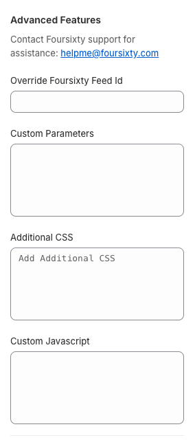
- Override Foursixty Feed ID: This allows you to specify a Foursixty ID when the gallery code does not detect it or detect it correctly.
Generally, this area is left blank as the gallery will pull the information from the account you have connected to your Foursixty App. - Custom Parameters: This allows you to add specific parameters to alter how the gallery works.
Generally, this is only used under the direction of the Foursixty Support Team as they would also supply the parameters to be added in there. - Additional CSS: This allows those who are familiar with using CSS for styling or those under the direction of the Foursixty Support Team to add additional CSS commands that will change the look of certain parts of the gallery.
Examples of this include (but are not limited to) removing the social share buttons from the pop-up, hiding the social post text completely, and other customizations. - Custom Javascript: This allows those who are familiar with using Javascript controls or those under the direction of the Foursixty Support Team to add additional script(s) that will help the gallery work better with your specific theme.
Examples of this include (but are not limited to) connecting to an AJAX cart system, or some translation text.
As always with Shopify Themes, make sure that you are clicking the Save Button after each customization to make sure it is applied to your galleries and not potentially lost because of a browser mishap.
If there are any other questions or concerns that come up that we can help answer for you, please feel free to reach out to the Foursixty Support Team at helpme@foursixty.com.